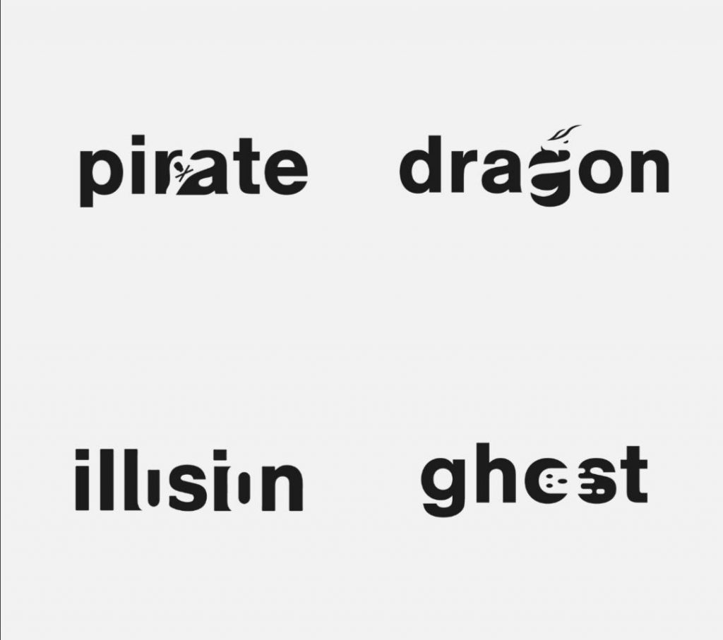
30 Wordmark creativi che utilizzano lo spazio negativo in modo brillante
Netherlands-based logo designer Sander has come up with an interesting project that features typography logos (or Wordmarks as he prefers to call them) of common words we use every day. He uses the negative space between the letters to create objects that visually represent the meanings of the words. For example, the design of the […]
30 Wordmark creativi che utilizzano lo spazio negativo in modo brillante Leggi tutto »
