Boosting sales is every owner’s dream. But converting website visitors into customers is a challenging task. You need to keep your eyes on the current trends in the market and understand what the customers are expecting.
The websites that match the level of expectations of the viewers convert better. If the viewers get what they are looking for in your site, it is quite obvious that they will go for purchase. There are chances, they will recommend your site to their friends and the peer groups. So, if you have quality products and if you know how to make people aware of them, your sales will grow naturally.
But, for every field, there are certain specific norms when it comes to market your products. You need to follow them. From every single category product, people expect something different. So the techniques also vary.
Here we bring some tips for graphic designers to market their ideas and increase their sales!
Use Cheerful Colors

Colour is a very crucial element for marketing graphic designs. They not only create an effective visual appeal but also communicate things in a unique way. From a marketer’s point of view, these points are very sensitive as they create moods, establish emotion and attract the viewers in the first place. If the viewers find the look of a website attractive, they read the texts on it.
In order to boost up your sales, you need to use rational and emotional appeal in a balanced way. When it comes to creating emotions, colors are far more important than words. Where words can not reach, color reaches easily.
Powerful Texts & Typography
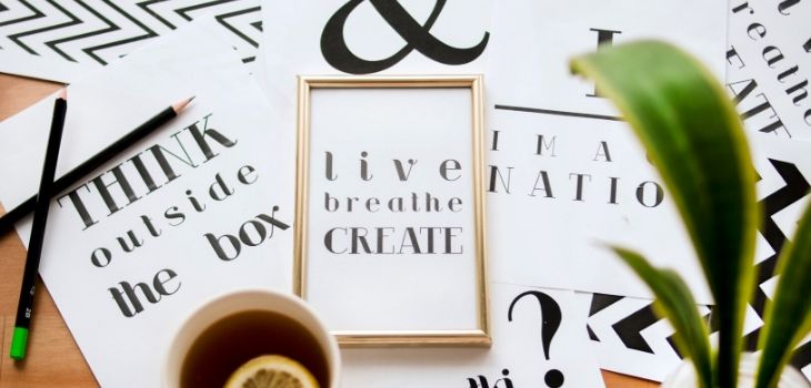
The text refers to a sequence of words. Typography is the visual appeal these sequences of words create. For a catchy website, it is essential to have a perfect combination of text and typography to deliver their message properly. These two elements complement each other in the process of communicating the message to the audiences. While text conveys some values verbally, typography gives a feeling of comfort. You have to be very careful in using these elements on your website. This is an essential part of graphic design promotion.
Here are some tips to use text and typography in your site –
- Your words should be simple and they should communicate all the information clearly. You have to plan your texts in such a way that they may present a complete picture of you before the readers. There should not be any scope of ambiguity.
- Your text should create some interest among your readers. It should be able to hold them back. If your text is powerful enough, the bounce rate will automatically go down.
- Typography should establish your desired feeling. It should be simple and clean. At the same time, it should also follow the house style of your brand.
- Whatever you do, it should be in accordance with your brand image. You should be very careful about your niche. Know who you are and where you stand. Be able to follow the line of expectation of your target group. Accordingly, you should choose your text and typography.
- Use lesser texts. A text-heavy website does not seem attractive to the viewers. With minimum text, you should communicate your message effectively.
- Go for competitive analysis. Try to be different from others. Don’t merge with the crowd. Try to claim and secure some space for yourself.
Experiment to see what works

An experiment is the mother of all successful innovations. In order to survive in the market, you have to be experimental with your work. The taste of people keeps changing with time. This is a natural phenomenon. In order to cope with that, you need to adapt to all new changes. This is a challenging task. You need to keep trying new ideas from time to time to maintain the bond with your viewers. And for this, you need to go for new experiments. But the question is, how? Answering this question will generate lots of graphic design marketing ideas.
Here are some tips for you –
- Understand the demand of the time and know the trend in the market. Accordingly, restructure your website and create a new look.
- You know your viewers well. Try to understand how their habits and preferences are changing. Go for a detailed analysis of your target group’s consumption and viewership patterns. Accordingly rearrange your website.
- Breaking monotony is your responsibility. But in order to do that, don’t lose the soil beneath your feet. People should be able to recognize you. Being yourself is the first challenge. Arouse a feeling that you are there to serve them. For their convenience, you keep changing your offerings from time to time.
If you want to analyze what design works for you the best, use Survey Funnel to Understand who your website visitors are & why they’re here. Engage your visitors using simple, unobtrusive surveys. It helps you increase your conversion rates by 450%.
Start a loyalty program
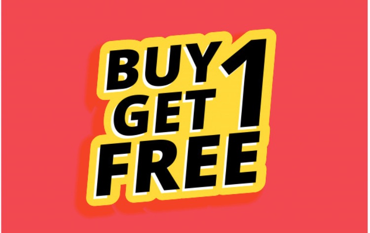
From time to time you need to go for some outbound techniques as well. You can introduce some rewards or discount offers. Everyone loves that!
You can add a point system where the buyer will get some points on every purchase. After the points reach a certain level, they will get some discounts or rewards. You may also keep some special offers for regular and loyal customers.
Showcase your portfolio on the website
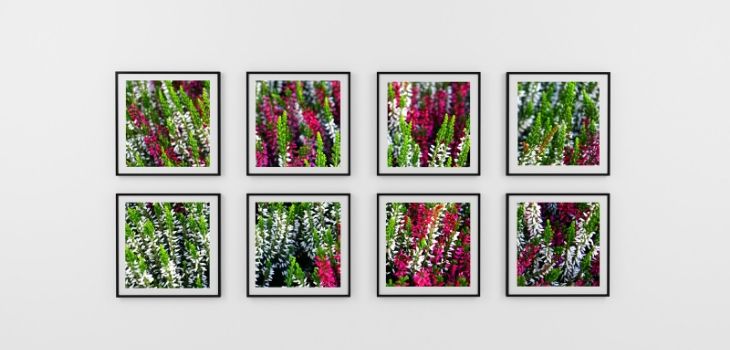
Your portfolio creates the first impression of you. Therefore, If your portfolio is impressive, half of your work is done.
Here are some tips to create an attractive portfolio –
- Showcase your best and most attractive works. Include enough variety to grab the attention of the viewers.
- Pictures on display in your galleries should be attractive enough to create interest among your viewers. Combine different visuals elements to achieve this. Set the background colors and framing options and other features nicely. Use effective navigations.
- Make it simple, to the point and clean. This will bring a classy look to your portfolio. Remember it is the quality that creates a good impression, not the quantity. Use only a few good quality content. But they should be appealing.
- As you are a creative designer, make your images talk. Don’t use much text. Use words only where required. Remember a good picture touches the hearts of the viewers in a much easier way than the words.
- Communicate clearly what exactly you do and in what way you can serve people. Also, establish where you differ from the rest in the market. It is your uniqueness that works best for you when you wish to sell your works.
These are some common tips that everyone can use. When you are selling online, you should make sure that your website represents what you do. After all, that is the only chance to make a first impression on your customers. You must make sure that it is a lasting one!